Case study · Indeflex
Three audience-tiered portals (sales partner, executive, merchant) on one design system, designed and shipped in production code as an embedded senior UX designer.
01 · Situation
02 · Task
Embed in the stack, set the design system, blueprint three audience-tiered experiences, and ship in production code at WCAG AAA.
03 · Action
End-to-end UI audit turned into 16 prioritized tickets so engineering shipped the highest-impact fixes first.
| What we needed | Precedent I studied | What I kept |
|---|---|---|
| Partner reporting | Shopify Partners, Stripe Connect, Toast for Restaurants | Metric-forward layout, inline search, drill-into-detail without full-page reloads. |
| Executive dashboards | Stripe Dashboard, Linear Insights, Looker | One number that matters per card, context under it, next action obvious. |
| Merchant portal | Square, Stripe, Toast | Consumer-grade polish, trust cues (PCI badge, money formatting, status). |
| Data tables | Linear, Retool, Stripe | Sortable columns, hover states, no column clipping, status chips with text + color. |
| Design system | Vercel Geist, Shopify Polaris, Stripe primitives | Tokens-first, components documented alongside the code, not a Figma island. |
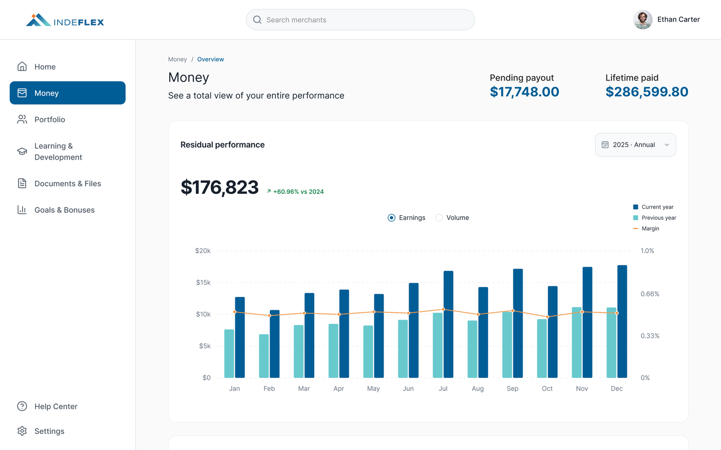
Brand colors extended into tokens (color, type, spacing, status). Components built once, consumed by all three surfaces, documented in Figma and shipped as code.
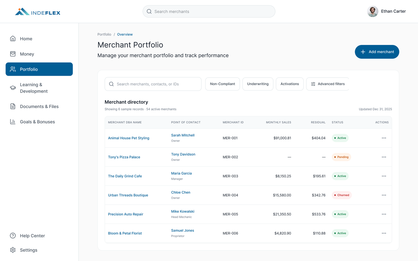
Filterable directory with searchable merchants, inline status chips, and the one number that matters per row (monthly sales + residual).
Every merchant has seven tabs (Overview, Processing, Residuals, Documents, Support, Transactions, Notes) on one shell. Each tab holds its own system of chips, inline edits, and status cues.
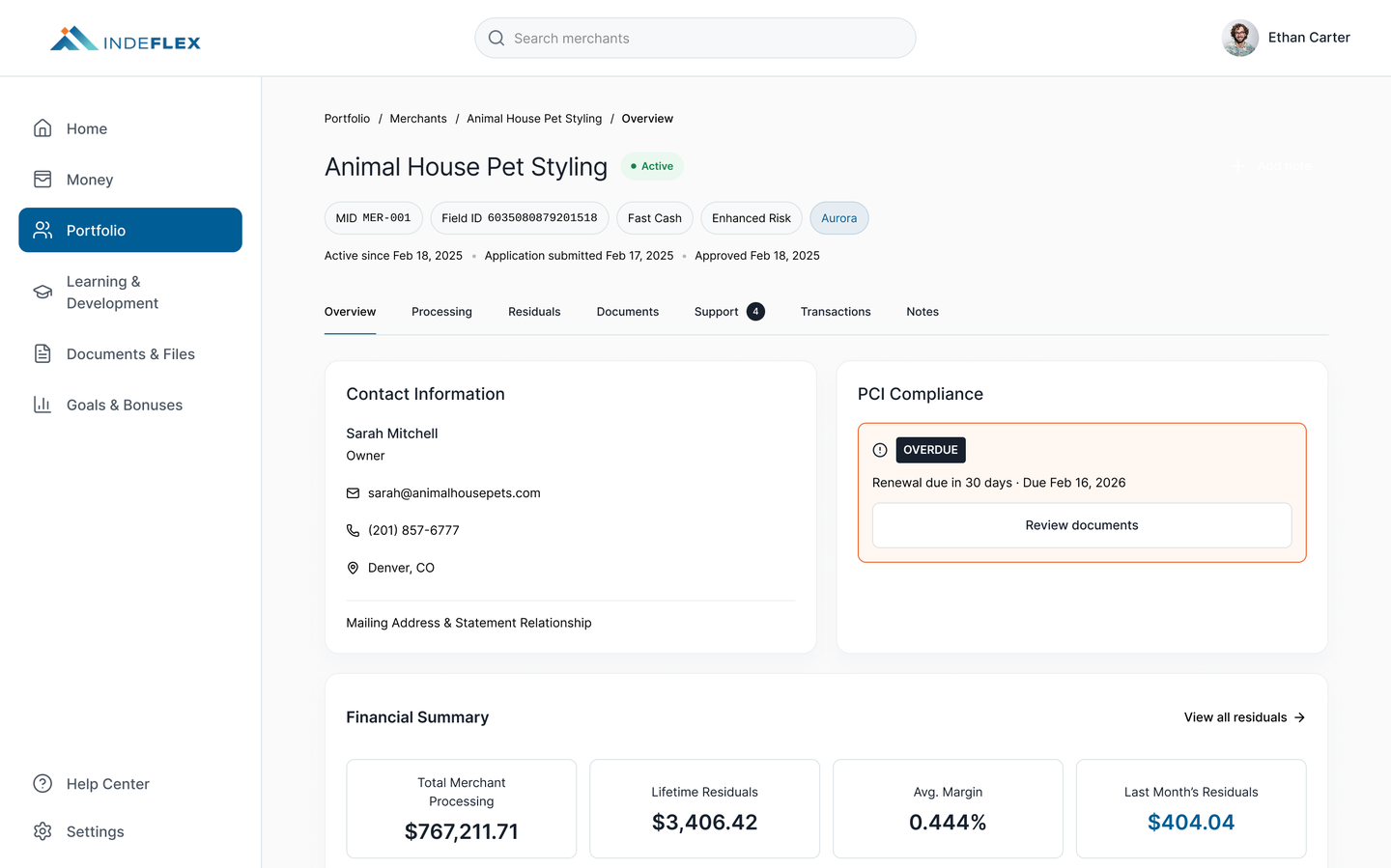
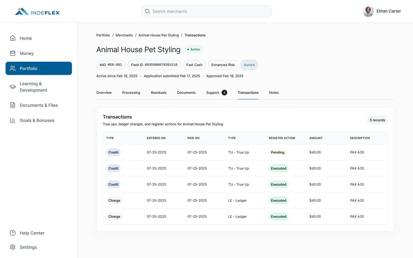
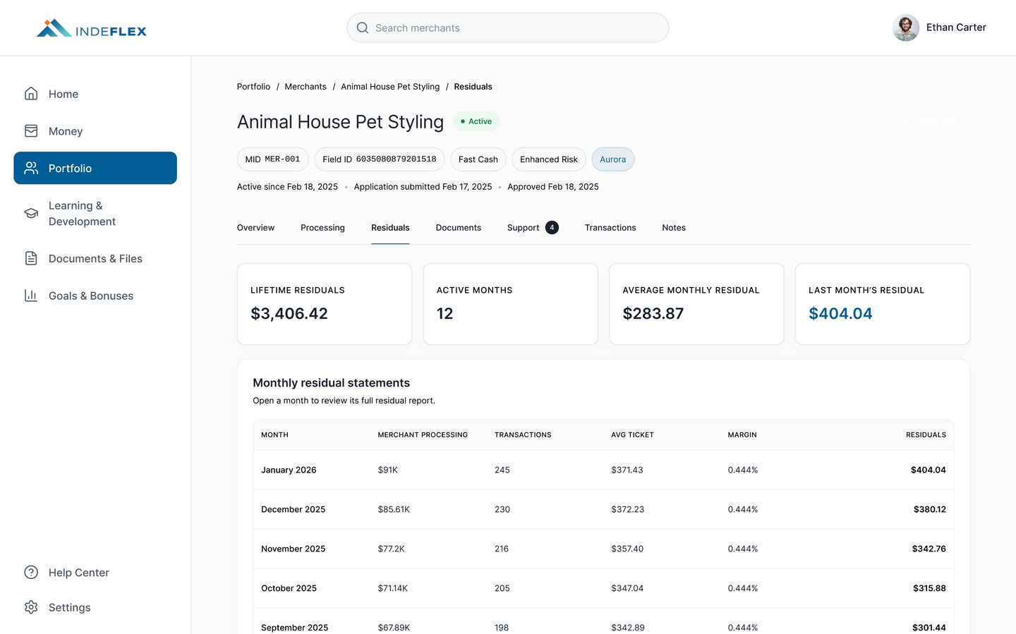
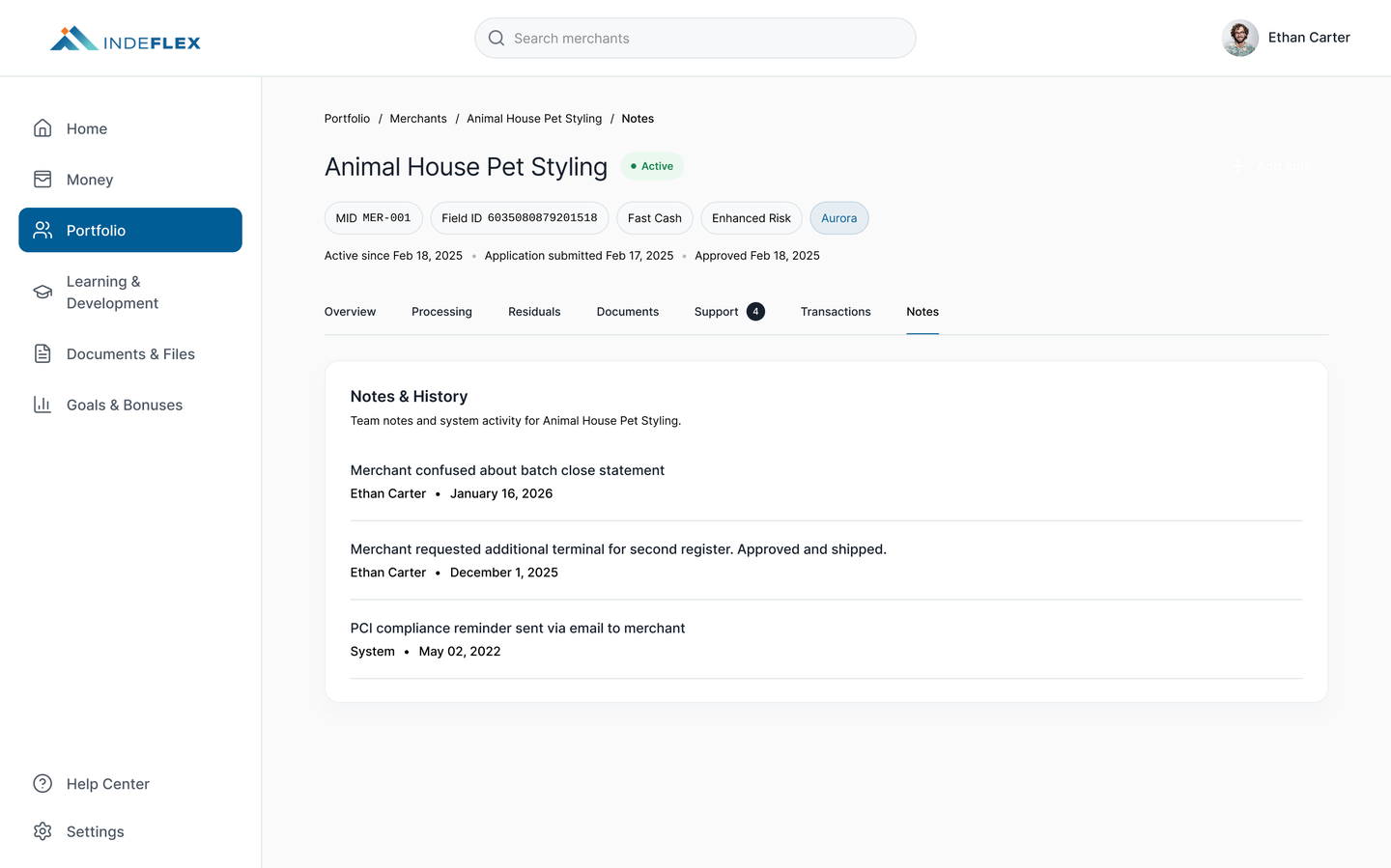
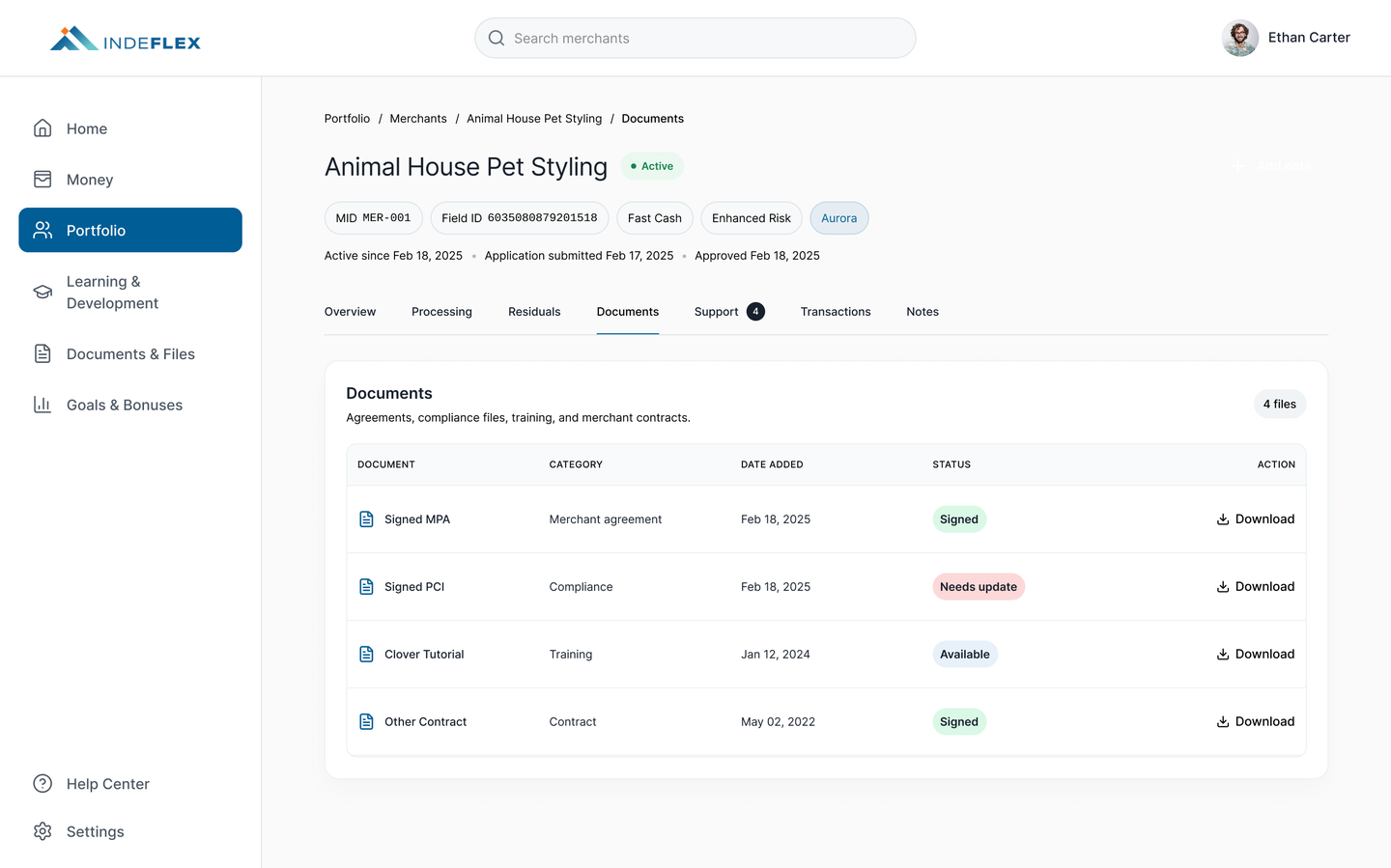
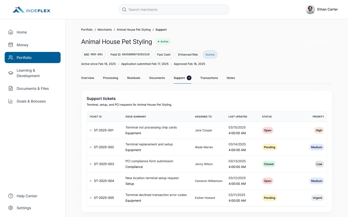
Overview. Contact, PCI compliance with explicit renewal date, financial summary, equipment, recent transactions, and notes, on one page.
Currency spacing and formatting standardized across every surface. One spec for separator, decimals, alignment, and zero-state. In payments, inconsistent numbers erode trust.
PCI icons now tied to actual status and paired with a text label (plus renewal date), so meaning never depends on color alone. WCAG AAA respected.
In-portal courses, workshops, and live sessions, with progress tracked and recommended-for-you based on recent conversations.
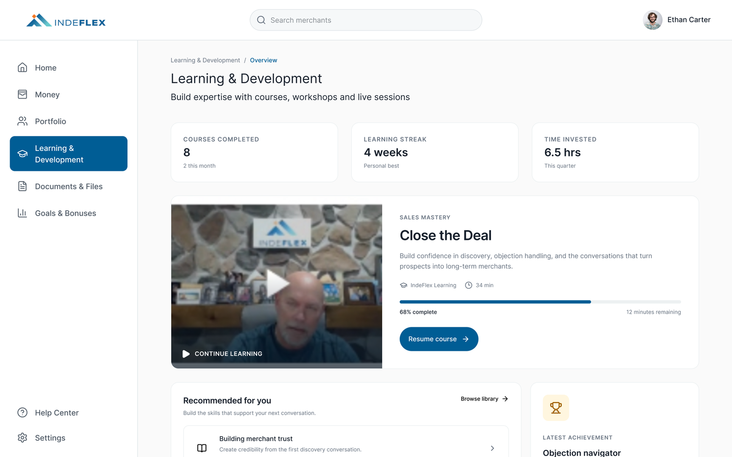
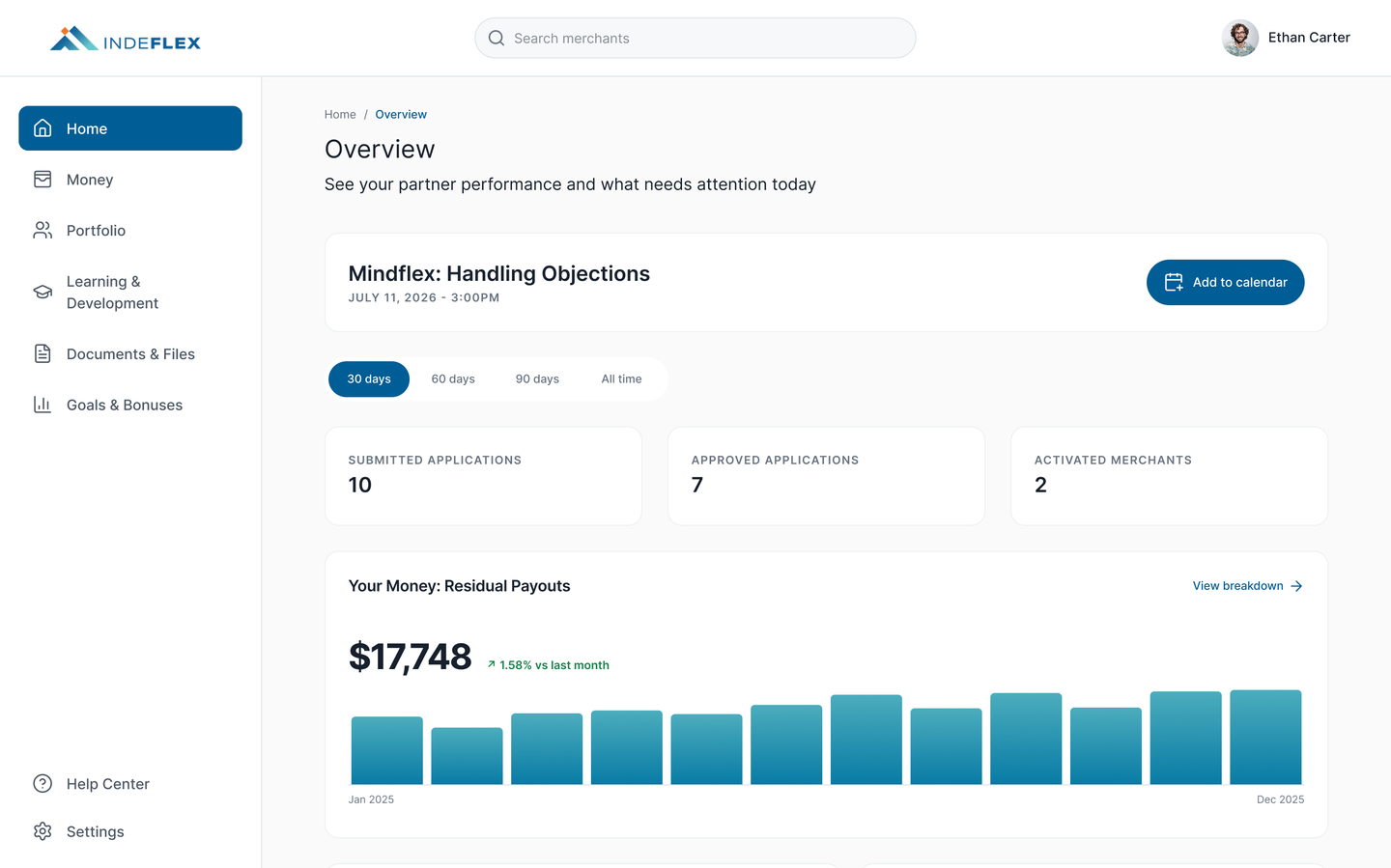
Metric-forward cards, context under each, next action one click away. Executives land on the dashboard and know where to act.
Designed to the polish bar of the leading small-business payment platforms. Currently in development.
| Audience | Primary job | How the surface serves them |
|---|---|---|
| Sales partner | Report, check on merchants, train, between client meetings | Partner portal: financial reports, merchant detail, sales training. |
| Indeflex executive | See company and partner performance at a glance | Executive portal: metric-forward dashboards, tables that scan. |
| Merchant | See payments, trust the platform, do business | Merchant portal: consumer-grade polish, trust cues, clear status. |
Partner portal fixes shipped first because partner churn was the sharpest risk. Executive portal next. Merchant portal got the longest design runway without blocking the others.
Figma into Claude Code to production front-end code, reviewed against the design system and a structured QA checklist I wrote for the project. Engineers review branches, not design files.
Weekly working sessions with product and engineering made trade-off calls together, in the room.
04 · Result
“Mimi fits right into our team and works faster than we can even build.” Justin Tanis · Indeflex
Design system. Dark Blue and Light Blue brand tokens, components, type scale, documented in Figma and shipped as code. Holds the next ten features without rework.
Status, money, and compliance conventions. One spec for currency formatting, PCI status, and status chips reused across every surface so the product reads consistently.
Partner, executive, and merchant portal patterns. Three audience-tiered templates on top of the same system, so adding a new audience is a template, not a redesign.
AI-native build workflow. Figma plus Claude Code plus structured QA checklist is now part of the team's velocity, not an experiment.
The Indeflex palette anchors on two brand colors used throughout the operator and merchant surfaces.